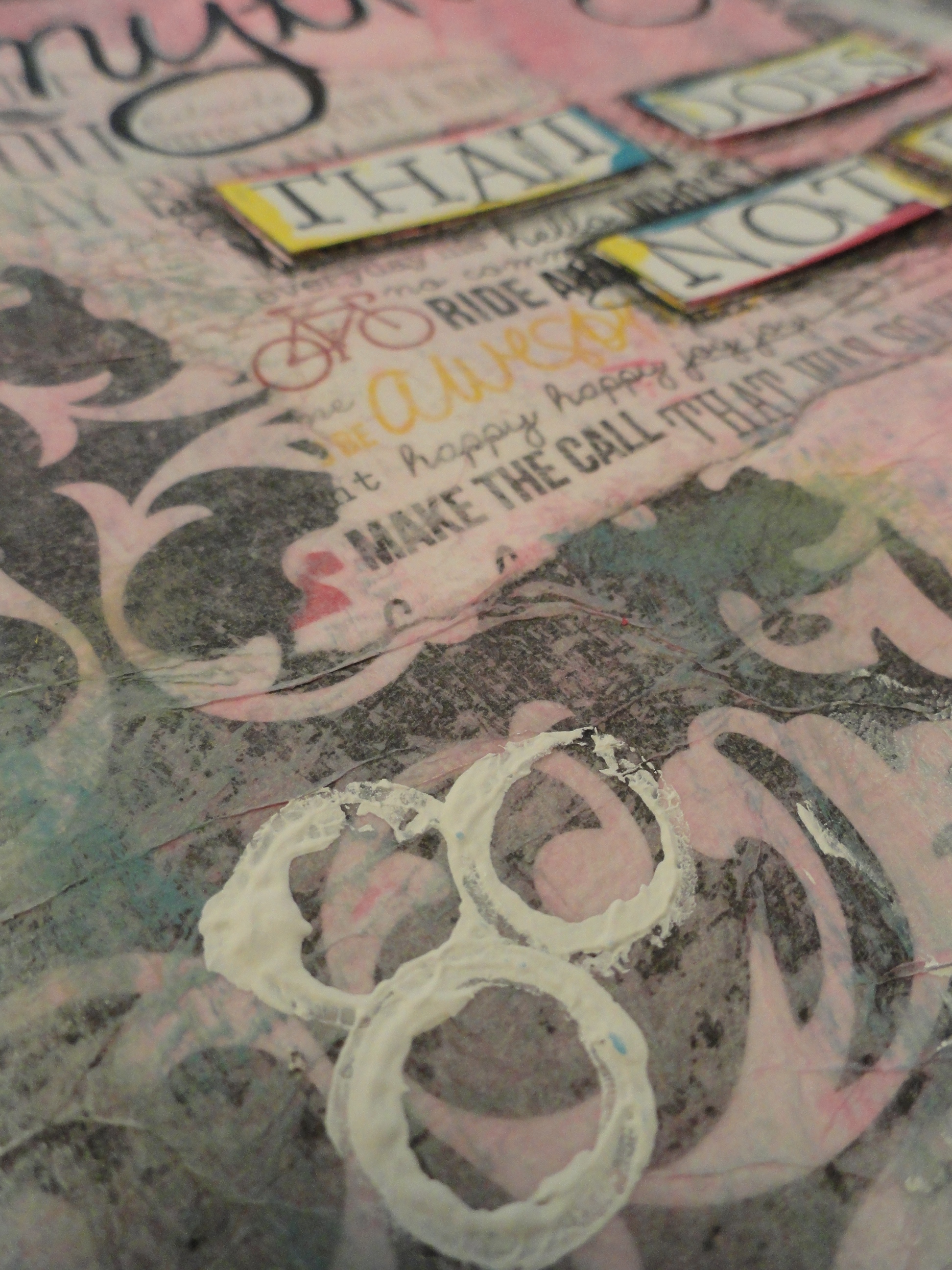
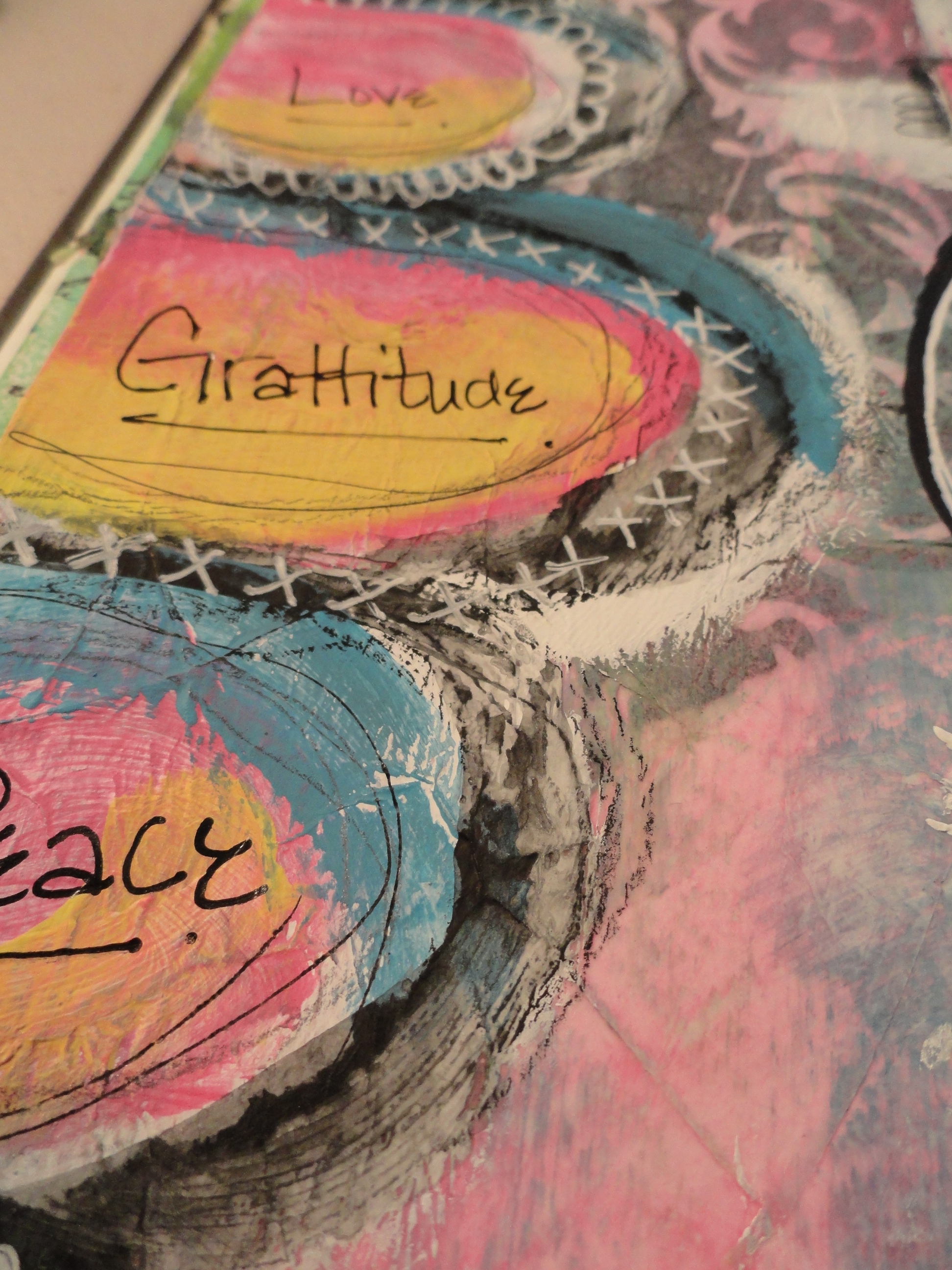
I am happy to announce that my new weekly art journal video has posted! I would love for you to check that out here:
Materials used:
- Acrylic paint colors:
- Americana: Carousel Pink (DA274), Turquoise Blue (DA268)
- Folk Art: Wicker White (901)
- Apple Barrel: Canary Yellow (20586)
- Black and white papers from Deco Page
- 2 miscellaneous scrap book papers (unknown source)
- Golden’s Matte Medium
- Black medium point Sharpie
- White Signo pen
- Black Stabilo pen
- Black Scarlet Lime Pilot pen
- #2 pencil
- Inexpensive 1 1/2 inch paint brush
- 1 inch brush
- Aleen’s tacky glue
- Wood mounted letter rubber stamps
- White card stock
- Black Archival ink
- Punchinella
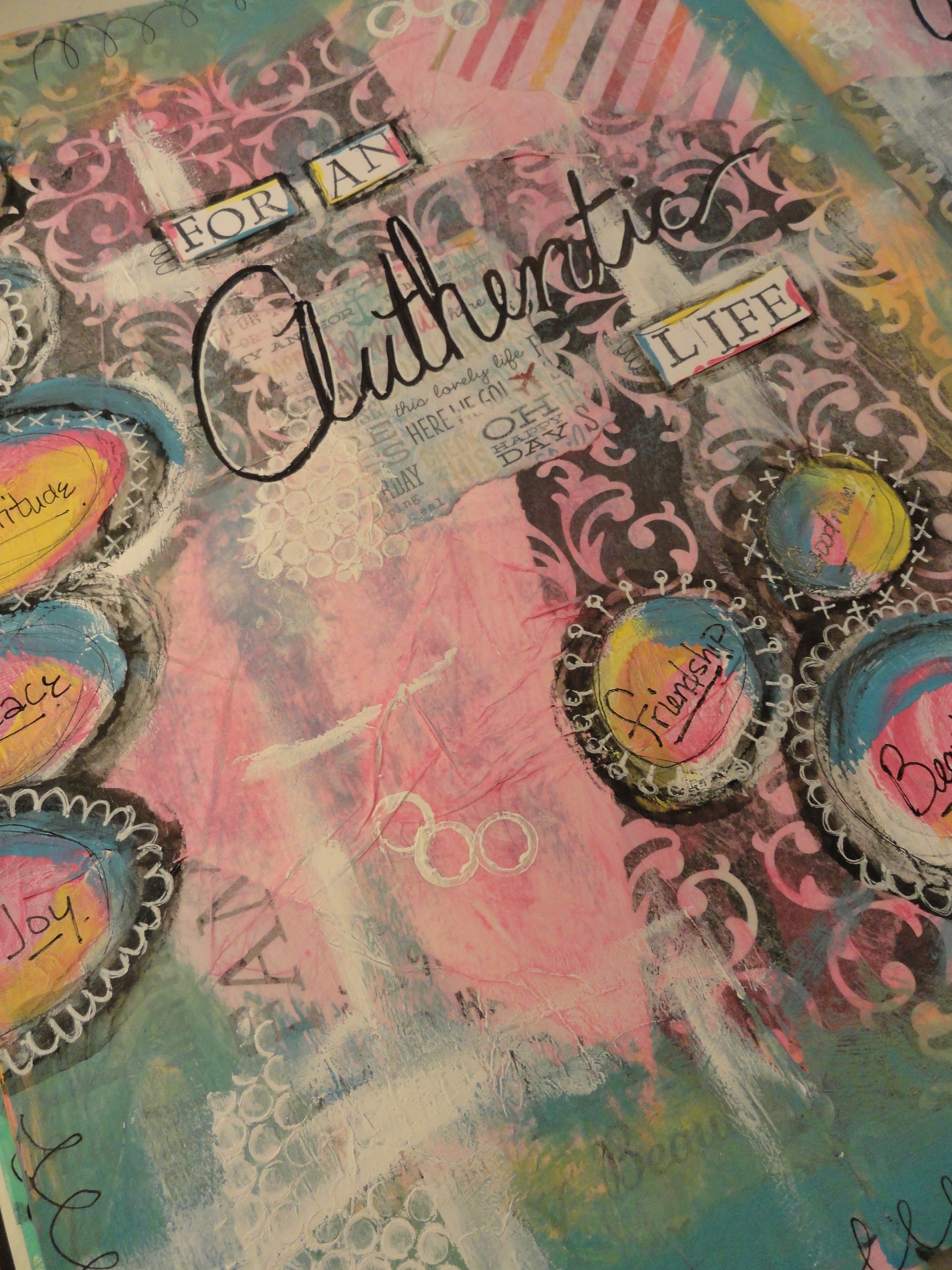
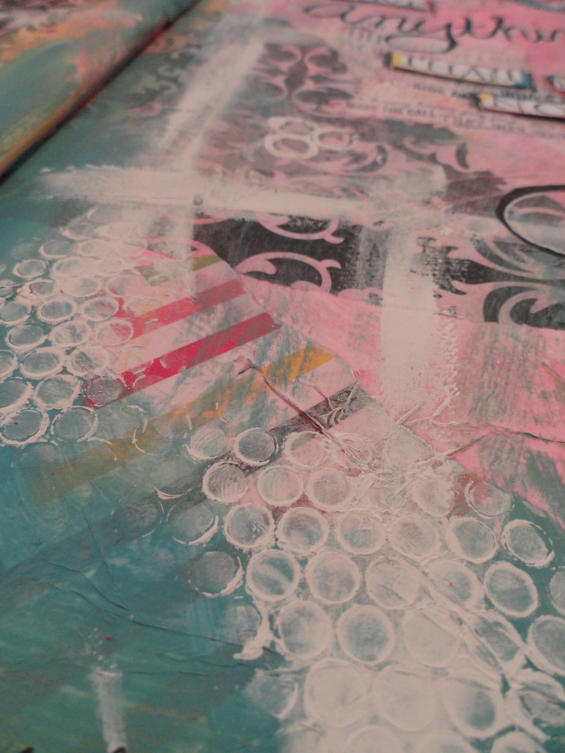
As usual, I went into this journal spread without any real idea about what it was I was wanting to journal! I did, however, know that I wanted to use the color pink.
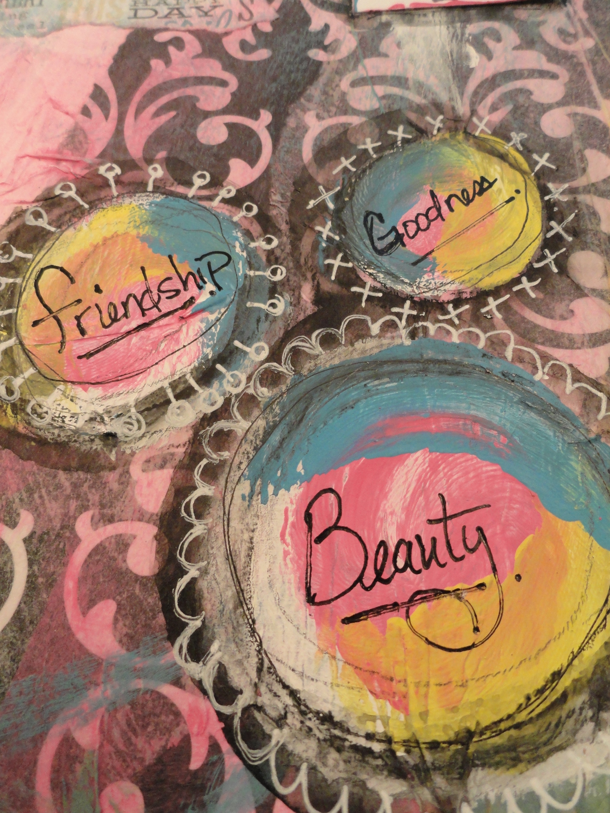
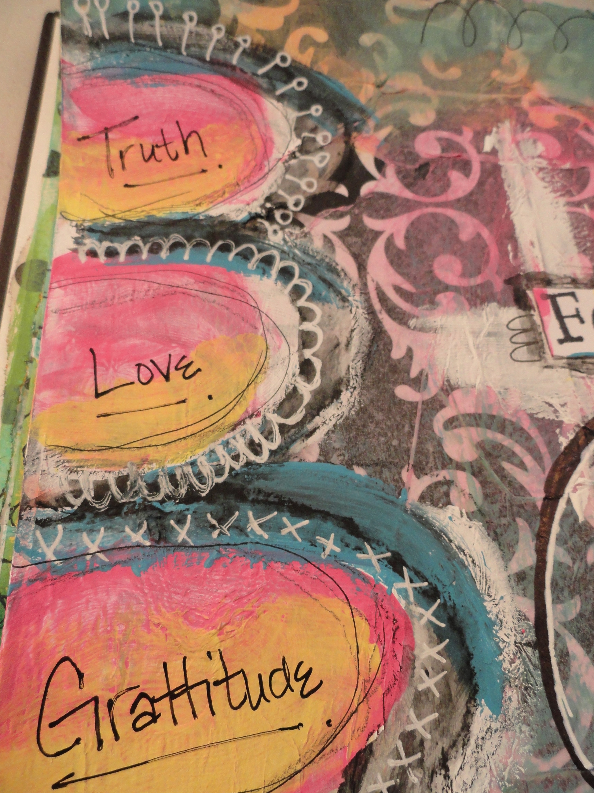
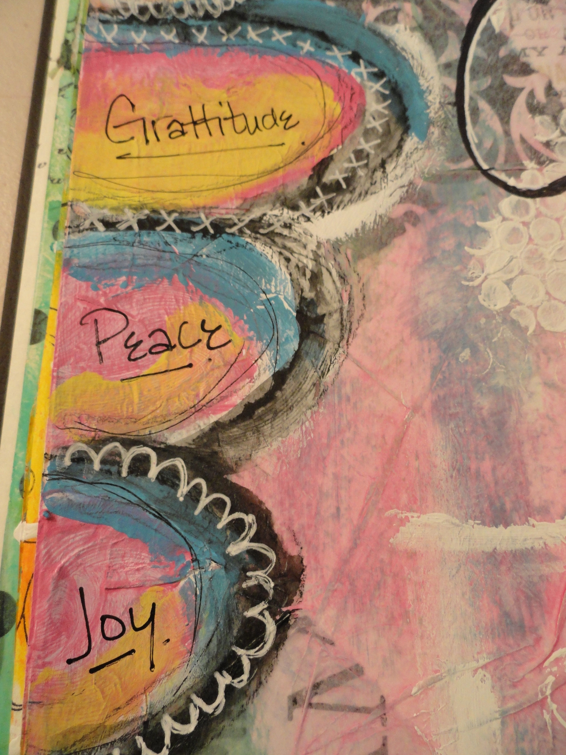
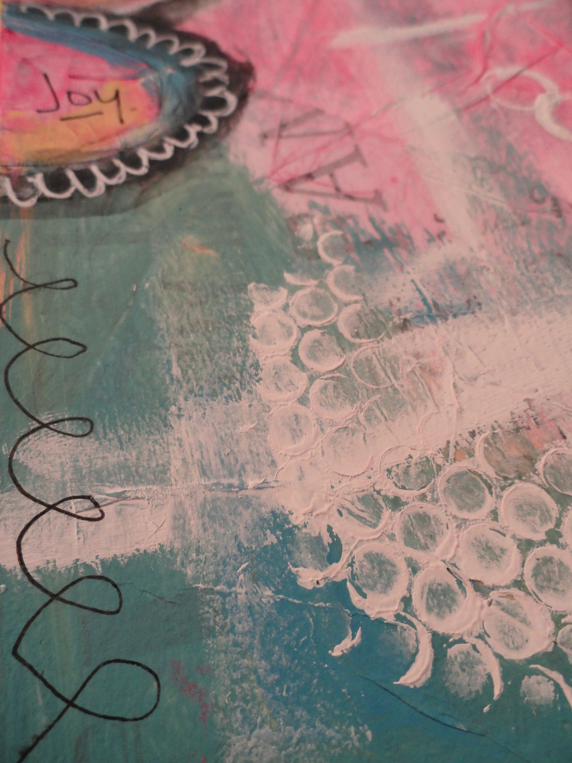
After I had gotten a wash of the color pink down, all I could think was “This page is VERY Pepto Bismol”! I knew it was time to pull out some more paint colors to add to the mix! Thankfully, out came my turquoise and Canary Yellow! After those colors were laid down, I was much happier with where this spread was heading!
Every week, I try to change things up just a little by adding a newly discovered technique, or a new product to the spread! This week I had added marks using a black Stabilo pencil! I LOVE this pencil!! I now want to find one in brown!!! It sounds like it writes on all sorts of surfaces, but for my art journaling page, it writes like a charcoal pencil, but add water to it, and it smudges up nice and dark – as you might have noticed in the video. I noticed when I dried it with my heat tool, it did dry a bit more transparent than what I had expected, but overall I still really love this product!
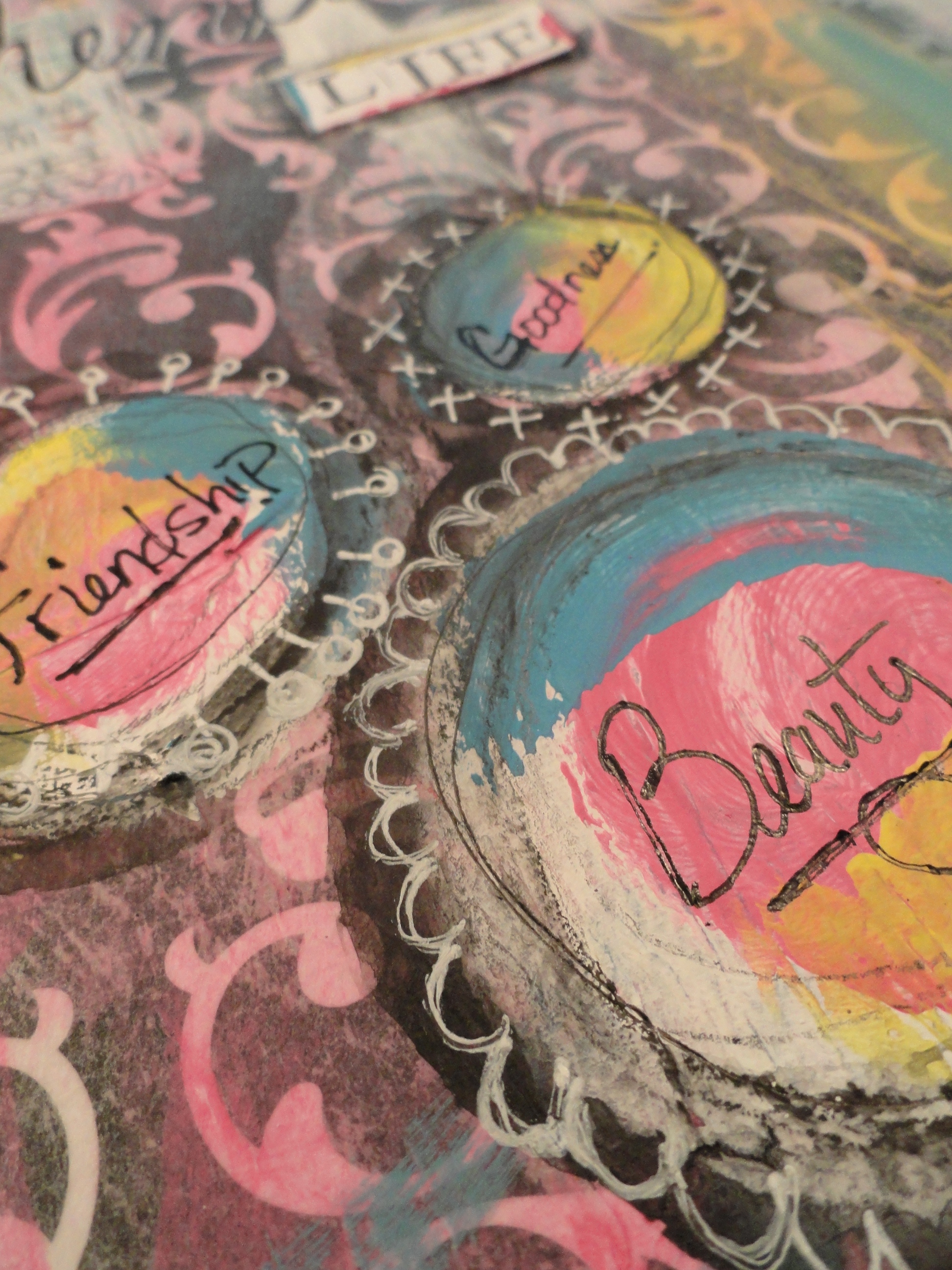
This week, I really wanted to grunge up my spread a little more than normal, giving it more of an antique-ey/aged looked. I did this by adding various marks with Stabilo pencil, black ink with a pen, and a #2 pencil! I really like the way that this turned out and I am thinking that this technique is going to stick around!
I also really like to add highlights using my white Signo pen, especially when you want something to pop off of dark areas of your spread! 🙂
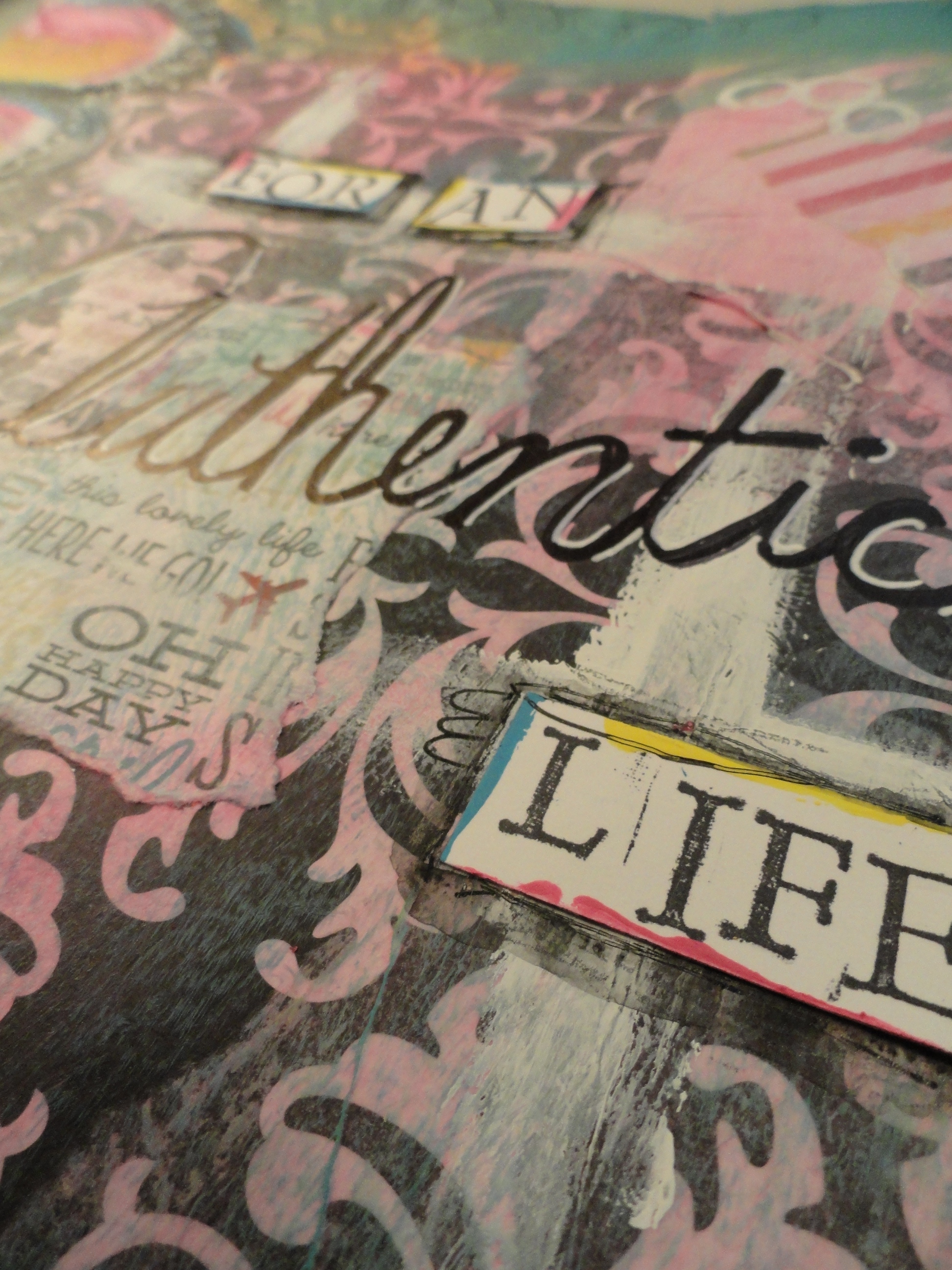
You may already know this, but while I am doing my weekly spreads, I make it a point not to try and stay in quiet so that I can hear what message my soul is trying to tell me, so that I can share it on my journal spread. This week was no different! I also added some of my words of truth throughout my spread in various places using my Scarlet Lime Pilot pen, and then I heard this message loud and clear, and just new that I needed to share this as my main message for this week:
“For an authentic life, remove anything that does not honor you.”
This is a thought that I have been trying to consciously implement in my life over the past 6 months!
As you may have noticed, I LOVE adding words to my spreads using rubber stamps, Archival ink and card stock, which are actually recycled business cards – I bet you didn’t know that!! 🙂 Anyway, this week I wanted to change that up by adding some of my own handwriting! I don’t normally like my handwriting, but I thought I would ’embrace the messy’ and just go for it!! I like the way that it turned out!
This week’s art journal spread is my favorite so far! I am really loving this weekly challenge that I have placed on myself, and cannot wait to see how my technique evolves over the next few weeks!! If you would like to follow along, please subscribe to this blog, and my YouTube channel!
I would also LOVE to hear anythings thoughts, comments, or questions you may have!! Maybe we can learn more together!! 🙂
Here is to a FABULOUS day!! 🙂
~Chrissie 😉
If you want to have a different life, you have to live differently!


